Talan Website Improvements & Iterations
My Role: UI/UX Designer & Researcher
Timeline: January 2026 - July 2026
Tools: Figma - Figma Make - Google Analytics 4 - Hotjar - Google Tag Manager - Google Search Console - Drupal
Project Overview
After the launch of Talan’s redesigned website, I worked on a series of improvements informed by how people were using it. The initial release had focused on the essential features needed to go live within a tight schedule and limited development availability. Once the site was live, we could examine where users encountered friction and which opportunities had been missed.
The project developed in two stages. First, I analyzed user behavior, designed additional modules, and refined journeys to support visitors at different levels of readiness. These findings also informed broader recommendations for the website’s direction. The second stage brought those recommendations into a wider update, with changes to the homepage and other key elements, alongside refreshed brand guidelines from head office.

The Challenge
The initial website launch established a new visual identity and a working foundation for Talan’s content. Time constraints and limited developer availability meant that some features and design variations had to wait.
After launch, the website still leaned heavily toward presenting information about the company. Visitors could explore its expertise, but the connection between that information, their own business needs, and a useful next step was not always clear.
Some users left before reaching relevant offers or supporting evidence. Others arrived through search, read an article, and had little guidance toward related services. A contact form was often the most visible next step, even when someone was still researching and was not ready to speak with a sales team.
During this period, Talan also acquired Thinkmax, a Microsoft partner providing enterprise services, and Insum, an Oracle partner specializing in application customization and development. Their existing websites, previously hosted on Shopify and WordPress, needed to be integrated into the Talan website.
This expanded the scope of the work. Both companies brought established expertise and their own content structures. The integration needed to make those capabilities easy to discover while presenting them as part of one coherent Talan experience. It also introduced new content needs that the initial module library did not fully accommodate.
The challenge was to improve existing journeys and incorporate the acquired companies within Drupal’s limitations and the development team’s capacity. Each new feature needed to solve a practical problem and remain reusable across the growing website.
My Approach
The work developed through two stages. The first focused on understanding user behavior and improving the existing experience. The second brought those findings into a broader website update, alongside refreshed brand guidelines.
Stage One: Post-Launch Analysis & Improvements
After launch, I reviewed how visitors used the website and identified where the existing design needed more support. This stage combined behavioral analysis with new module designs and journey improvements, while accommodating the integration of Thinkmax and Insum.
Understanding user behavior
I examined important pages through Hotjar heatmaps and click maps, looking at where users focused their attention and where they stopped engaging. Rage clicks, abandoned forms, and interrupted journeys helped highlight areas that needed closer investigation.
Google Analytics provided context about traffic and navigation patterns. I also used Search Console and SEMrush to review organic entry points and how well page content matched search intent.
To evaluate individual modules, I installed custom tracking tags to measure clicks and scroll behavior. This helped distinguish sections that users overlooked from those they reached but rarely interacted with.

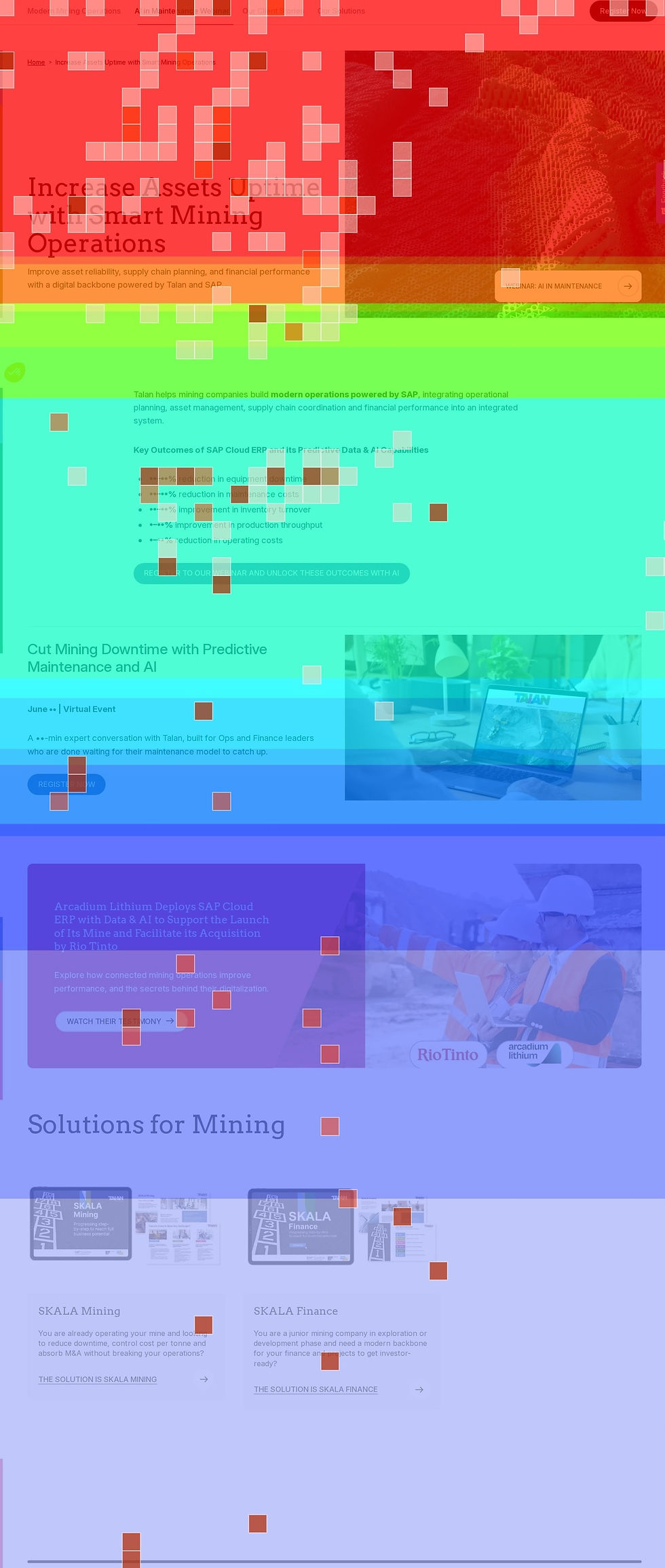


Selected Page Designs
Here are some examples of pages I designed using the new modules and updated user flows, with layouts tailored to the content and clearer paths to related solutions and next steps.


Iteration One Demo
Here is a demo of the project’s first iteration, showing the new modules and some pages in action.
Stage Two: Website Evolution & Brand Alignment
The second stage brought the website’s broader direction into focus. An additional audit highlighted gaps in how visitors moved toward conversion, while new brand guidelines and offer structures from head office introduced further changes. Together, these informed an update to some important pages and key user journeys.
UX Audit & Benchmarking
I performed an additional UX audit to investigate pain points and breakdowns across the homepage, offer pages, and informational content. I also compared the experience with competitors that performed more effectively in areas such as solution discovery, messaging, and conversion guidance.
Several informational blogs attracted high click volumes but generated little further engagement and no conversions during the reviewed period. Visitors were finding the content, yet few continued toward a related service or meaningful next step.
The homepage presented a similar opportunity. Its visuals attracted attention, but large areas offered little guidance, and the opening content did not immediately explain how Talan could help. Important solution messaging appeared farther down the page than many visitors reached.
These findings supported a more conversion-led direction. The website needed to help people connect their needs with Talan’s services and continue their research through relevant resources, with contact opportunities available when they were ready.
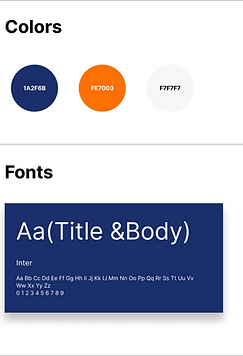
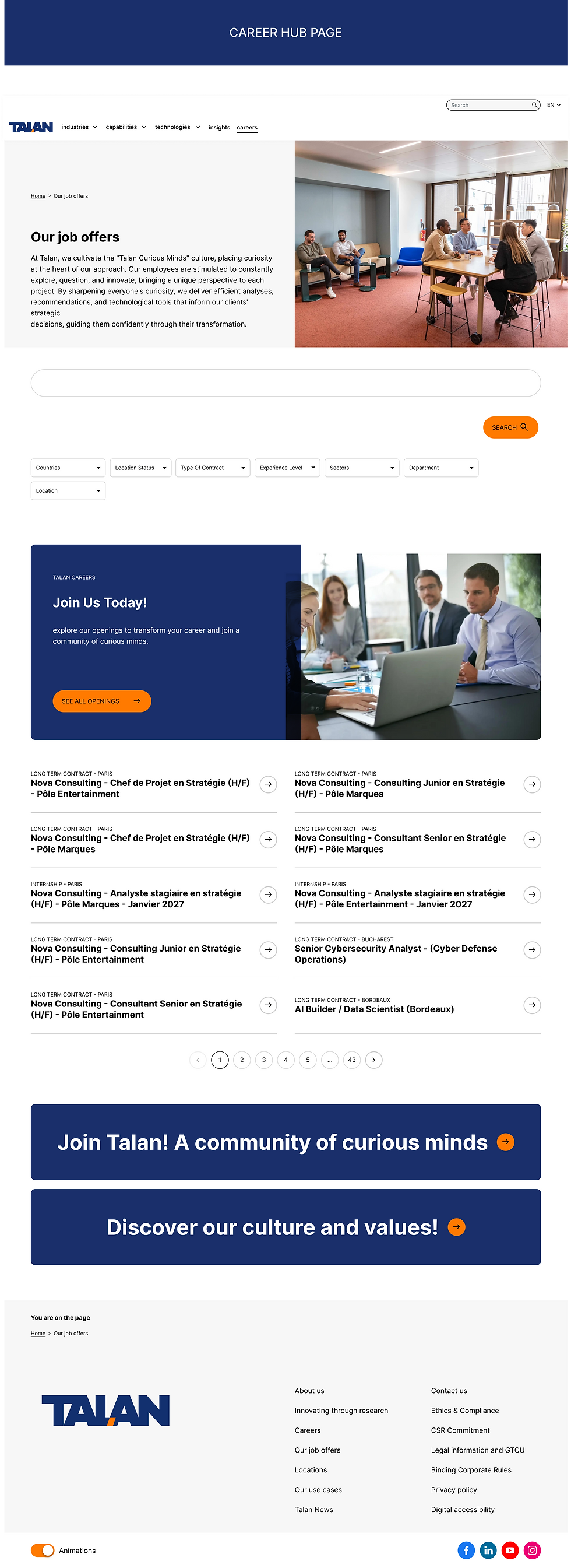
Selected Page Final Designs
Here are some examples of pages from the second iteration, showing the refreshed branding and updated layouts, with clearer solution messaging and more connected user journeys.


Iteration Two Demo
Here is a demo of the project’s second iteration, showing the new branding and some pages in action.
The Results
The post-launch project gave us an opportunity to evaluate the website in a real-world setting and understand how people actually interacted with it. These observations helped establish a prioritized list of updates and enhancements, shaped by the platform’s technical limitations and collaboration with developers.
The first stage expanded the module library and introduced clearer connections between pages, with relevant next steps for visitors at different levels of readiness. It also supported the integration of Thinkmax and Insum’s expertise into the Talan website.
The second stage brought a stronger conversion focus to the homepage and key user journeys. Updated offer structures and refreshed brand guidelines were reflected across page templates and modules, creating a more cohesive experience across sections and regions.

Stronger Homepage Engagement
Visitors interacted more with homepage content navigation from the homepage was increased by up to 30%
30% More Conversions Across The website
Updated journeys helped visitors progress toward conversion.
15+ New Keywords Ranking for Talan
Expanded search visibility in newer practice areas, including Oracle Forms and Microsoft solutions such as business Copilot integration.
54% More Asset Downloads
More visitors engaged with resources that supported their research before making contact.
Fewer Rage Clicks
Eliminated on some pages and reduced by at least 40% on others.
Up to 50% Longer Time on Site
Visitors spent more time engaging with the website.
What I Learned
This project showed me how much becomes visible once a website is in use. A section that seems clear in a design file may be overlooked on a live page. A visually prominent element may attract clicks without helping someone move forward.
It also helped me become more deliberate about prioritization. Some problems could be addressed through a module variation or a better connection between pages. Others required a broader change in how the website presented Talan’s value.
Working through both stages strengthened my ability to connect behavioral evidence to design decisions and carry those decisions into an evolving website, while accounting for the people and platform responsible for delivering it.